Sponsors


Get My Color (White Balance) Right?
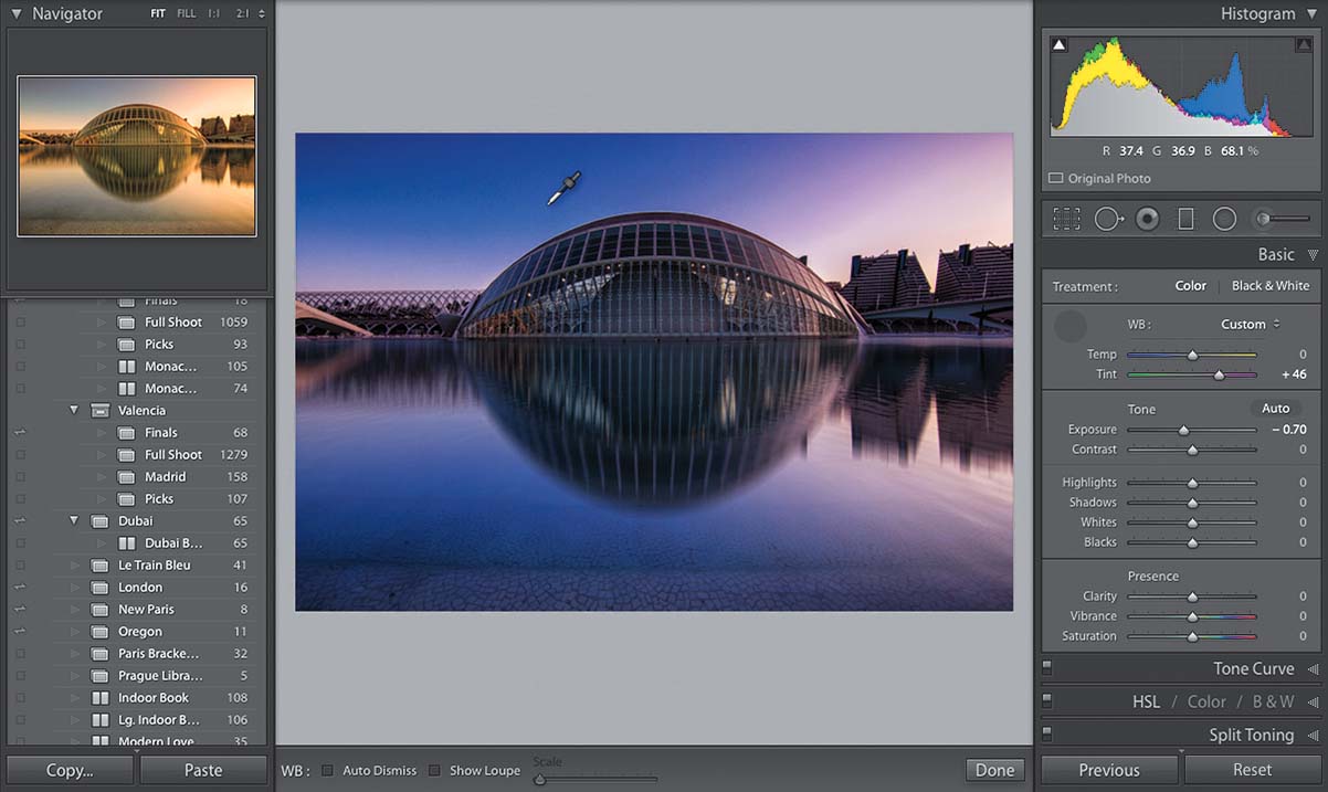
Get your white balance right and everything else falls into place. There are three ways to do this: (1) Try the white balance presets at the top of the Develop module’s Basic panel. By default, the WB menu is set to As Shot, which means you’re seeing the white balance as set in the camera when you took the shot. Click on that menu and a full list of white balance choices you could have chosen in-camera appears (the full list only appears if you shot in RAW. If you shot in JPEG, you’ll only see As Shot, Auto, and Custom, and by the way, custom means “do it yourself by moving sliders,” so it’s really not a preset). Choose the preset that best matches the lighting when you took the shot. If you choose one that precisely matches the lighting situation (e.g., you shot in an office with fluorescent lights, so you choose Fluorescent), but it doesn’t look good, just pick a different one. Who cares about the name? Choose the one that looks right to you. (2) The second method is to get as close as you can using those presets, and then tweak the color using the Temp and Tint sliders. The sliders themselves show you which color is added by dragging one way or the other, so drag toward the color you want more of (dragging toward yellow gives you a warmer look; dragging toward blue gives you a cooler look). (3) The third method is my favorite: get the White Balance Selector tool (the eyedropper at the top of the Basic panel), and click it on something light gray in your image. If there’s nothing light gray, try to find something neutral (not too dark, not too bright, not too colorful). As you move your cursor around your image, you get a live preview in the Navigator panel at the top of the left side Panels area (as seen above). Very helpful.